Deliverable: Mobile App Framework
Creative Role: UX Designer, UI Designer, User Researcher, Tester
Team: Bukky Oluseye, Olive Odagbu, Samantha Long, Muna Mahamud
Software: Figma, Mural, Adobe Illustrator, Adobe Photoshop, Adobe After Effects
Date: 2020
The Brief
- Demographic: 16-30 yr olds
- Create an App framework or Landing Page specification
- Packshot/hero image with title and strapline (10 words max)
- Demo for YouTube or IG
- Bio on directors and contributors
- Social artwork (static or moving animation 1080x1080)
- Must follow the Reebok brand design guideline
Research
To better understand how an app can help with reaching a legacy and what people think of the word legacy, we decided to do user research consisting of surveys, face to face interviews (zoom due to covid), desk research and We wanted to know what our user demographic thought of Legacy. Their own personal legacies and the challenges they face in writing theirs. Some unique themes started to emerge, such as reaching goals, helping others, family ...etc. Which led us to consider this quote from Hamilton about legacy: " It’s planting seeds in a garden you never get to see."
This idea of growth, and flourishing became a theme that arose again and again. This is also were the flowering/blooming imagery used in our brand came from, and how we came up with the name Floriss.
Below are some of the questions i put on my Instagram stories to get qualitative feedback from the public.
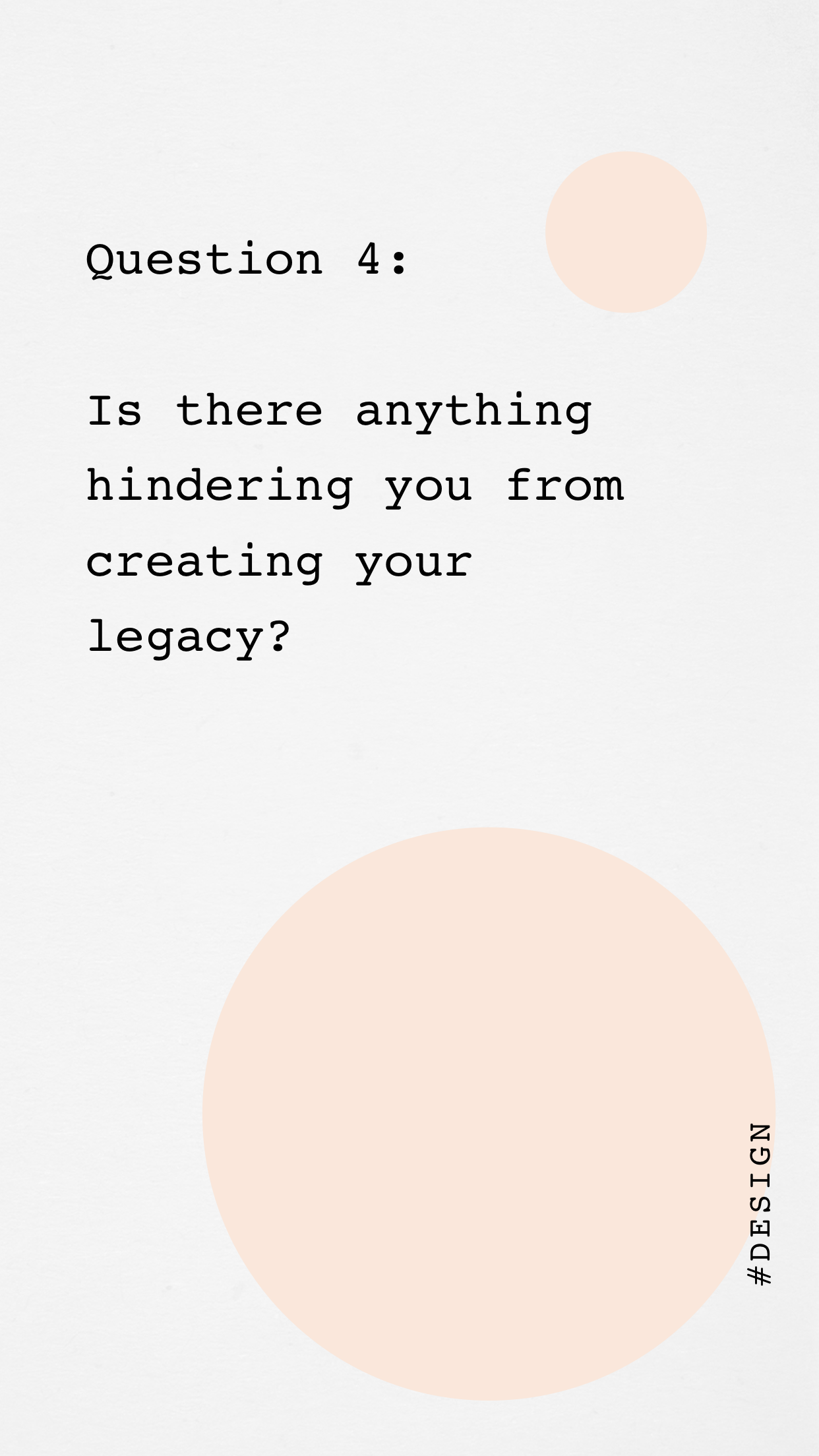
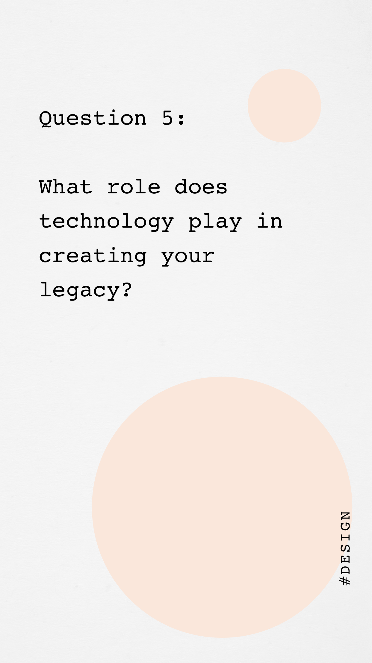
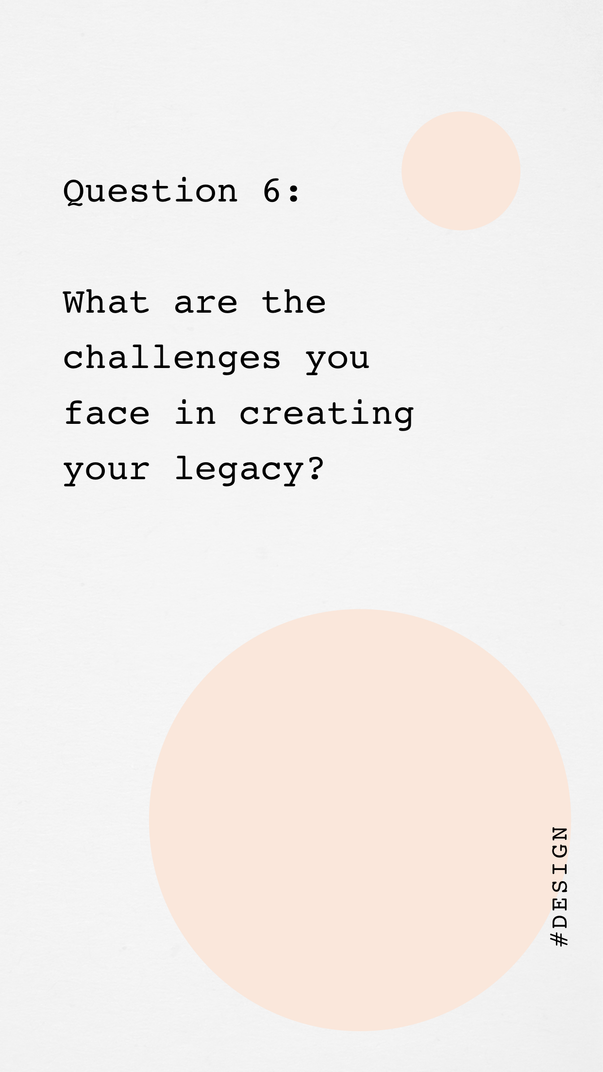
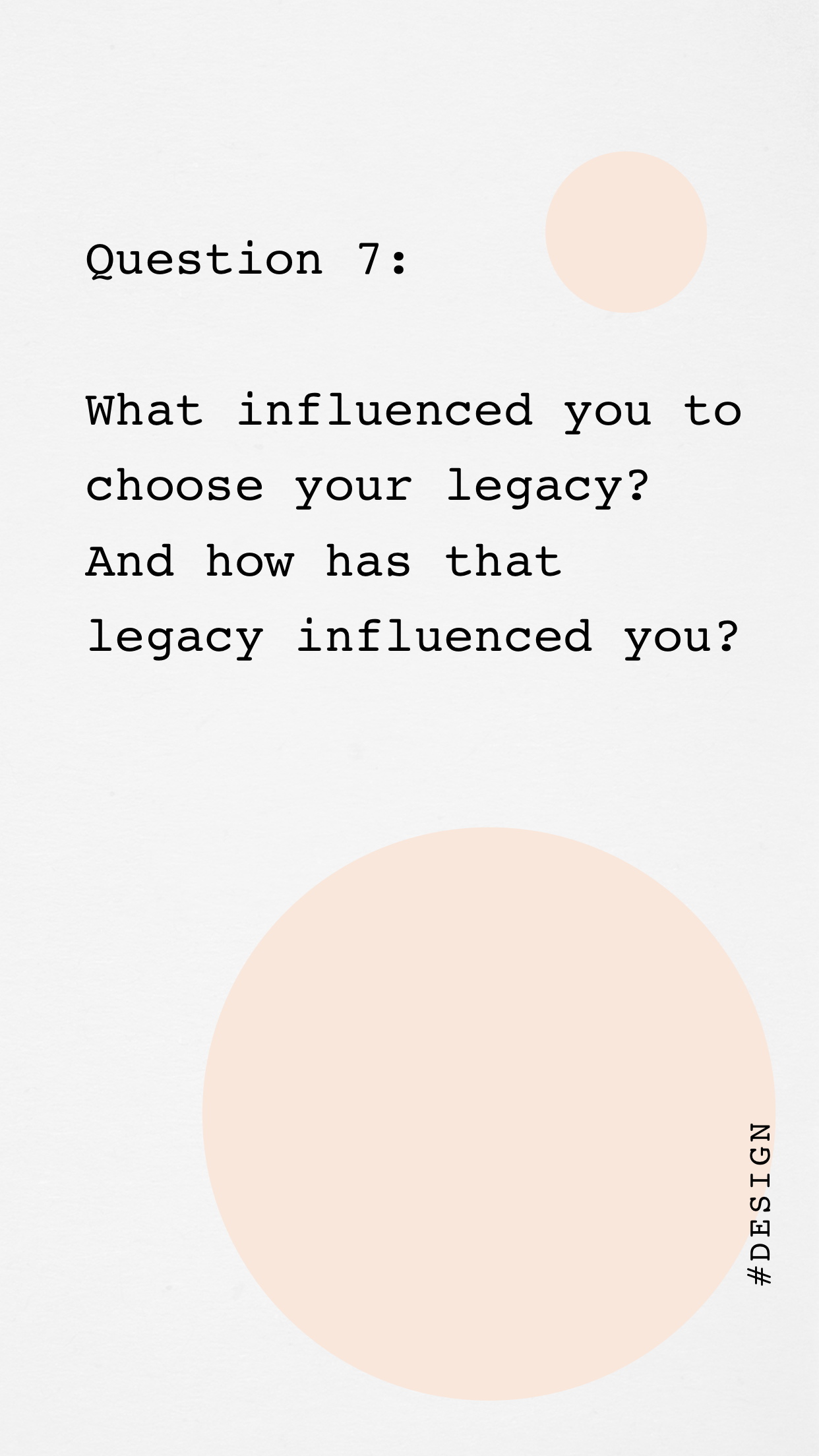
From our research we decided to create a problem and a solution statement so that we can clearly know what the app focuses on.
Problem Statement
"Young people find online platforms overwhelming as it promotes a culture of self and peer criticism, which hinders them from moving forward towards their goal"
Solution Statement
"A platform for individual to be able to realise personal projects individually or as part of collaborative work. With a focus on empathetic self pacing and positive peer reinforcement"
User Journey
We decided to split up the tasks for the app by each choosing a section, working on it, then coming back as a team to finalise it.
I was in charge of creating the community section, after our ideation and 'scamp it up' session where we made a feature map, I then created different user journeys and narrow down what we would want in the community section.
I started with a flow diagram, then i went on to do rough low-fi wireframes.
Below is the first wireframe I made for the community section. At this point in the project we were focussing more on features and visual placement, and had not yet finalised our colour themes, font and overall creative direction.
Testing and Feedback
To begin with, we considered having our testers test both our first wireframe as well as other similar apps, but as we were limited to time and social distancing we decided to minimise the amount of testing we could do and focus on our app alone.
Having made our first wireframe, we decided to test it out by having people that fit within our testing audience try the app. This was done over zoom.
For the testing, we first asked them questions about themselves, hobbies, apps the frequently use and if they use any app similar to what we were trying to make.
Then, we gave them a few minutes to look around the app and get familiar. Afterwards we asked them questions to see how they would navigate through the app and carefully monitored their responses. At the end, once they were finished we asked them for feedback that we then used to further improve the app.
From the feedback, we found that people were confused with certain icons, and placement of features. We also found that specifically with the community page, the post and forum section didn't seem that different, so we decided to merge it as one. We also found that we didn't want the app to be seen as a social media platform, so I got rid of the stories section and like buttons.
Creative Direction
Final Colour Scheme
Typography
Final Wireframe
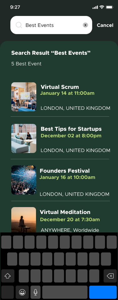
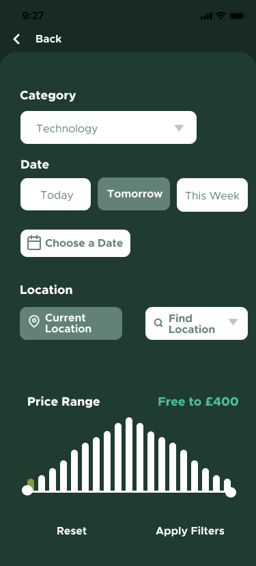
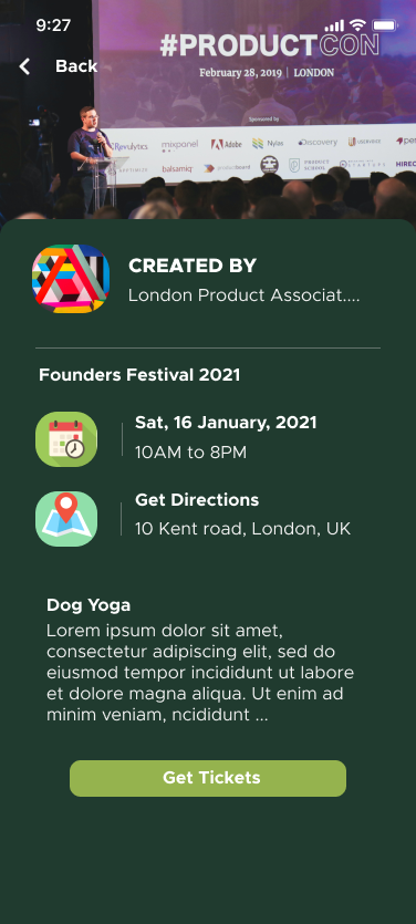
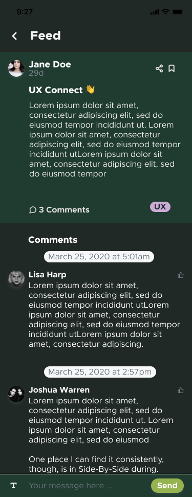
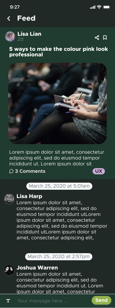
Improved Community Section

community event page
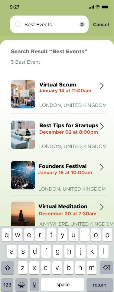
search page
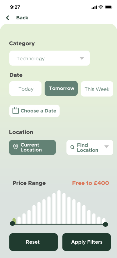
events filter page
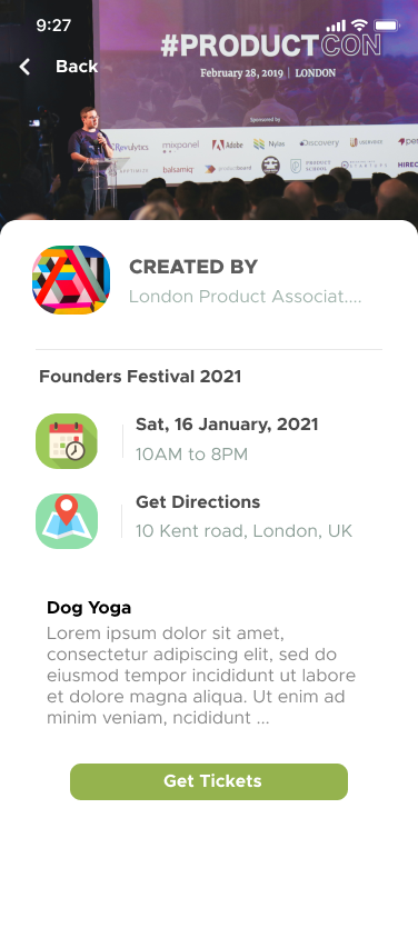
events expanded page

community feed paege

communities
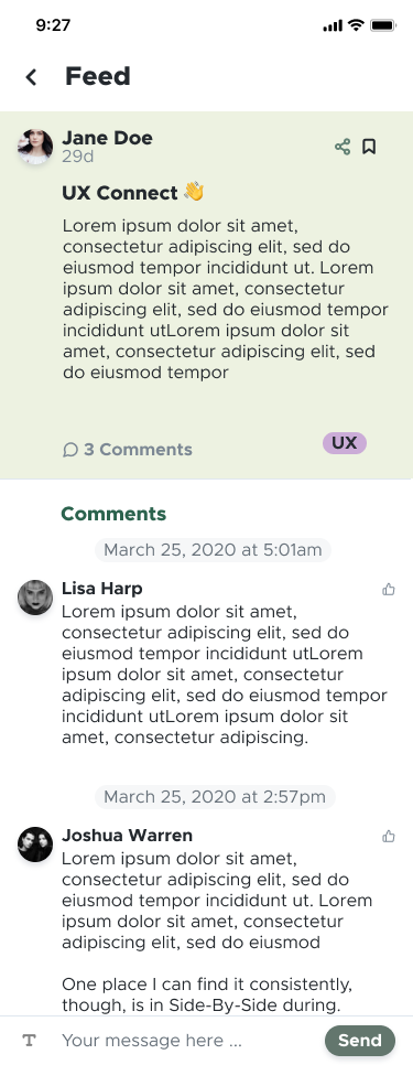
post expanded
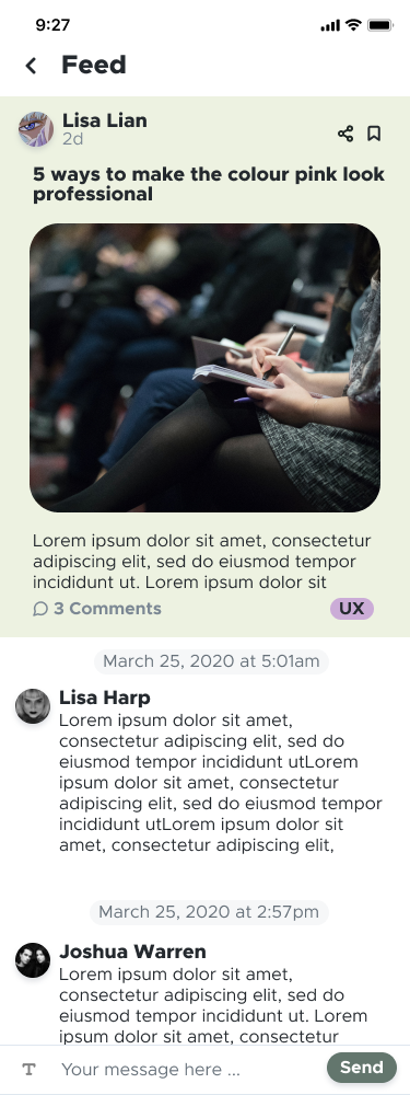
post expanded with image

post relating to community
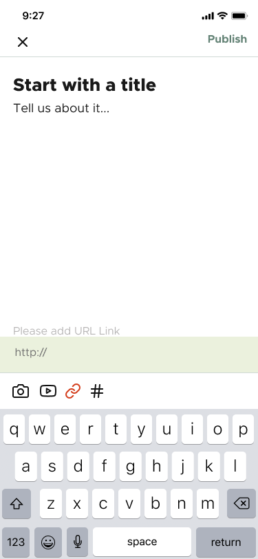
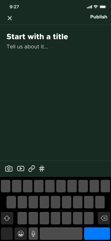
add to feed section
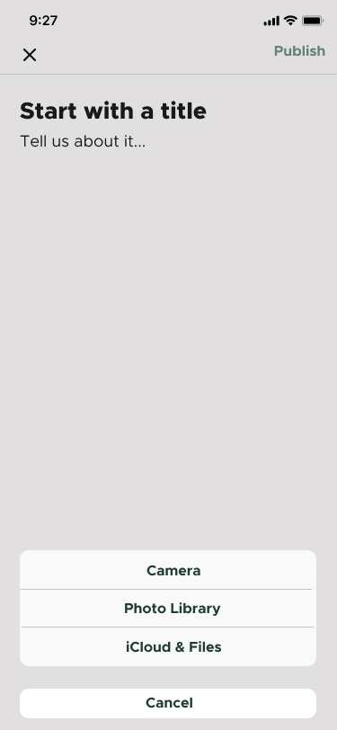
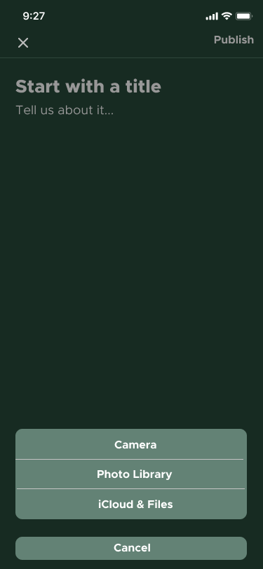
add picture to draft
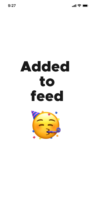
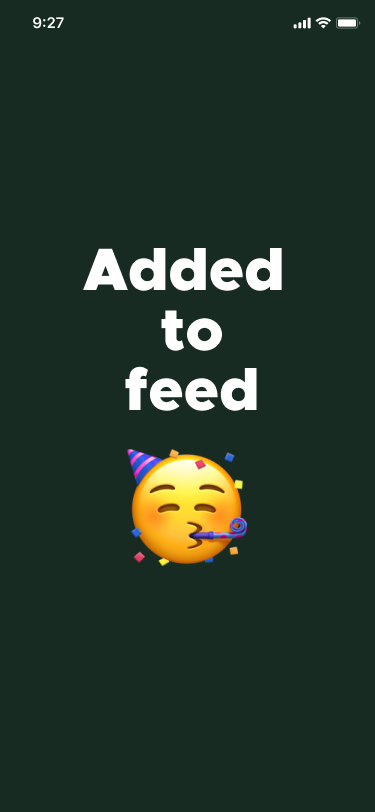
published to feed
Dark Mode





Mockups
Demo for YouTube
Social Media Video
Feedback and Reflection
So what are the growth prospects both for the app and us? Well for the app framework, the next step in the product design would be to do some more user testing to improve the app and begin sending off the designs to software developers.
The growth prospects for us: we’ve grown immensely through this course and have taken away invaluable knowledge. As a team we are all hoping to up-skill and gain a lot more experience. You’ve seen what can be produced in less than 6 weeks, imagine the endless possibilities if we had more time.
This is our first completed iteration, having asked others to test it again, the sentiment went from neutral to positive.